[av_one_full first min_height=” vertical_alignment=” space=” custom_margin=” margin=’0px’ padding=’0px’ border=” border_color=” radius=’0px’ background_color=” src=” background_position=’top left’ background_repeat=’no-repeat’ animation=” mobile_breaking=” mobile_display=”]
[av_textblock size=” font_color=” color=” av-medium-font-size=” av-small-font-size=” av-mini-font-size=” admin_preview_bg=”]
VIV WORLDWIDE TAKES-OFF WITH A FRESH LOOK
The Feed to Food network is back to business, with a “facelift” to its branding
The VIV mission to link professionals from Feed to Food continues and evolves, surely looking at the future. In the midst of these very dynamic and challenging times, the VIV organization takes the opportunity to improve its communication scheme. Looking at the encouraging news from the world with business being restored and country borders being gradually reopened after months of uncertainty, VIV is giving its branding and design a compelling new look.
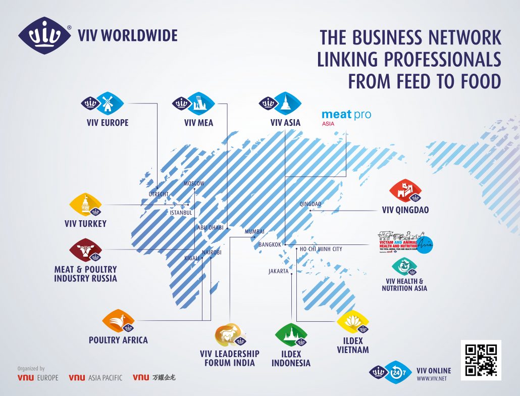
VIV worldwide portfolio, unfolded
Much has happened within the VIV portfolio and organization in the recent years: events grew in size; market shares shifted amongst world regions, new territories were explored, more initiatives were launched and new partnerships have been established.
“During the pandemic peak period, we took the time to consolidate our existing brand architecture” says Heiko M. Stutzinger, Director of VIV worldwide. “The VIV worldwide mission is strongly intertwined with our client’s business development. Introducing this new look, our goal is to provide a clear picture of where we are and where we are heading to. We want to offer to all our stakeholders a straightforward message of what VIV worldwide exactly represents. At the same time, we make sure we keep consistent with the well-known VIV identity” explains Stutzinger.
Core identity and platforms empowerment
VIV worldwide will keep its core identity. On the other hand, the re-branding envisions an empowerment of each single platform by providing them with unique and characteristic visual features that make each show easily recognizable. The VIV network consists of hub events and international events. In a very complex business environment, VIV aims at providing a clear and attractive design.
“That’s how the VIV MEA logo shapes out from the hosting city skyline; the VIV Europe visual generates from the power of a “Dutch” wind turbine; VIV Asia logo affirms the show’s prestige standing tall with its Asiatic-style stupa; VIV Turkey identifies via an unmistakable Maiden’s Tower; VIV Qingdao logo remarks its solid presence in China via a dynamic version of the Great Wall. Likewise, the lotus national flower defines the ILDEX Vietnam logo identity; while ILDEX Indonesia is represented by the Borobudur national landmark. Poultry Africa logo keeps its focus on the specie element bringing within its new brand-scheme the already established feather chicken visual” says Elena Geremia, Senior MarCom manager of VIV worldwide.
The VIV Online platform maintains its role as a year-long connection between the show dates and regions, and the logo says exactly this: VIV Online is there for the industry 24/7, non-stop.
Finally, all visuals share a common and unique feature: the VIV “diamond” frame-shape, highlighting the ties that each show and platform constitute within a complete and inter-connected VIV portfolio and Feed to Food network.
Continuous improvement in a changing world
New ways of doing business are developing constantly, not only fueled by Covid-19 challenges, within the exhibition and animal protein production industry. In a time of changes, VIV works and focuses on continuous improvement.
Find more on the new VIV worldwide brochure, and see you at the next VIV appointment.
[/av_textblock]
[/av_one_full]
[av_hr class=’default’ height=’50’ shadow=’no-shadow’ position=’center’ custom_border=’av-border-thin’ custom_width=’50px’ custom_border_color=” custom_margin_top=’30px’ custom_margin_bottom=’30px’ icon_select=’yes’ custom_icon_color=” icon=’ue808′ av-desktop-hide=” av-medium-hide=” av-small-hide=” av-mini-hide=”]
[av_textblock size=” font_color=’custom’ color=’#a81010′ av-medium-font-size=” av-small-font-size=” av-mini-font-size=” admin_preview_bg=”]
Download Press Release
[/av_textblock]
[av_one_full first min_height=” vertical_alignment=” space=” custom_margin=” margin=’0px’ padding=’0px’ border=” border_color=” radius=’0px’ background_color=” src=” background_position=’top left’ background_repeat=’no-repeat’ animation=” mobile_breaking=” mobile_display=”][/av_one_full]
[av_button label=’Full Press Release’ link=’manually,https://www.ildex-vietnam.com/wp-content/uploads/2020/07/VIV-worldwide-fresh-look-Press-release_July-2020.docx’ link_target=’_blank’ size=’small’ position=’center’ icon_select=’yes’ icon=’ue82d’ font=’entypo-fontello’ color=’orange’ custom_bg=’#444444′ custom_font=’#ffffff’ admin_preview_bg=”]